Tuesday, 31 May 2016

Finish - Interior Design

Continue to the project last week, I designed a family house which followed to Vietnam culture. In my experience, the interior in the UK and Vietnam have some differences such as the location of living room and kitchen or the garage and living room. Therefore, I designed the ground floor with three room which was living room, garage and kitchen. However, I designed a skylight in the middle house which help ventilation. The limitation in this software is difficult addition material on floor or wall. It always addition a block and must be a room. For example, when I want to add material to skylight, I cannot add the stone or granite on this plan.


The image makes by owner blog ( 30/5/2016)


The image makes by owner blog ( 30/5/2016)

I created first floor plan which is a clone of ground plan. I changed some furniture and decorated again such as doors and windows. Moreover, I designed the bathroom inside a bedroom. I designed two bedrooms and two bathroom in the first floor.


The image makes by owner blog ( 30/5/2016)

Next, I added some furniture in the bedroom and material in bathroom.


The image makes by owner blog ( 30/5/2016)

I designed another bathroom in front of the stair.


The image makes by owner blog ( 30/5/2016)

The balcony was side by side the bathroom which help ventilation for bathroom.


The image makes by owner blog ( 30/5/2016)

Moreover, I added some furniture in bedroom and bathroom such as table, unit media, lamb and desk.


The image makes by owner blog ( 30/5/2016)

Last step, I decorated bathroom with sink and shower.


The image makes by owner blog ( 30/5/2016)

This is a 3D ground of the final piece. 

The image makes by owner blog ( 30/5/2016)

This is a 2D ground plan of final piece.


The image makes by owner blog ( 30/5/2016)

This is a 3D first floor of final piece


The image makes by owner blog ( 30/5/2016)

This is a 2D first floor of final piece


The image makes by owner blog ( 30/5/2016)


When I used Autodesk Homestyler, I released it useful for sketch 3D interior but it had some limitation. If I compare it with CAD, CAD is flexible drawing 2D plan. Moreover, If I compare it with 3ds max, 3ds max can control lighting and high quality image. However, Autodesk Homestyler has some strong points such as the library furniture and easy tools design. I can learn this software by myself after I research and try some tools.   

The measurement in my design.

On the ground floor


The image makes by owner blog ( 2/6/2016)

On the first floor


The image makes by owner blog ( 02/6/2016)

Moreover, I have a panorama 360 in my design.

http://www.homestyler.com/designprofile/8d7c8a9b-cbec-42d0-995d-2db48bb1f88d 


Wednesday, 25 May 2016

Autodesk Homestyler - Interior design spaces

Today, I learn a new software to design 2D and 3D interior such as homestyler. I created the initial idea using Auto desk homestyler software. The brief gives me a lot of freedom to design an interior space on theme of my choice.
   
I design a residential space for family. First image is a plan of interior which is an initial idea to familiarise with the software and to learn how to use it. Next, it is a 3D image of the design which is the same. 


The image makes by owner blog ( 24/5/2016)


The image makes by owner blog ( 24/5/2016)

The process of making the design

Firstly, I draw a basic plan in 2D view. 


The image makes by owner blog ( 25/5/2016)

Following that I used a catalogue to select the stair and door. My research on the Neufert Architect shows that the rule of designing space could start with an entrance point. The rule in architectural design could not straight view from the entrance to the back. Moreover, it must have a corner traffic and some barriers to create visual view and flow of the air.


The image makes by owner blog ( 25/5/2016)

A corner sofa, I used it in the catalogue of the living room. 


The image makes by owner blog ( 25/5/2016)

I added more furniture such as table, media unit, TV and a chair. In addition, I added more spaces which are garage and kitchen.


The image makes by owner blog ( 25/5/2016)

Then, I added the door for traffic between the living room and kitchen, the kitchen and garage with entrance door.


The image makes by owner blog ( 25/5/2016)

Next, I added the window in the living room and the kitchen. I used the same size of the window to keep design consistent.


The image makes by owner blog ( 25/5/2016)

Kitchen appliances were added along with cooker, sink, refrigerator and work top.


The image makes by owner blog ( 25/5/2016)

The brief idea apply a young family consisting of husband, wife and baby who are 6 or 12 months. This project is designed a house for family home with two floors. I started design the ground floor because that will control the size of the house and the layout inside the house. 

I research from designer and architect such as Nuefert


The image takes from internet source ( 25/5/2016)
  
This is my chosen influence and I will use the principles describe in this book in my design.


The image makes by owner blog ( 25/5/2016)


The image makes by owner blog ( 25/5/2016)

This is a development of the design with 3D view and the lighting.

Software limitation in AutoDesk Homestyler

In comparison to other softwares such as CAD and 3ds Max. I found the limitation in Homestyler which was difficult to control the wall and limit furniture.

The next step of the design

I will change the material on the floor in the kitchen and garage. Next, I choose the wall colour for each room. I will use influence of other designers to inform my work.


Reflective Journal - Advertising campaign

After two weeks, I designed an advertising campaign and my aim in this advertising was an architecture which was storage solution interior. The target in this project was family because everybody when they born and grow up, they need a suitable place to keep and create a new memory. Therefore, I chose this project to develop my design skills.

I had researched about advertising architecture during the time. It was a variety of advertising architecture such as showed the plan, section or perspective of the building. In my project, I used the interior and put it inside the glasses which advertised and created a curious on each people when they look at it. Indeed, storage solution was needed for each family and that was not easy if a customer had the lack of knowledge about decorate interior so they need some advice from architecture company.

My success in this project is the idea . However, my final product does not perfect because I have a limit in my design skills. After my presentation, I got some feedback from my friend and  tutor. Therefore, I know my strength and weakness in the design.


This is a photograph taken by owner of the blog ( 25/05/2016)


Thursday, 19 May 2016

Final piece - advertising campaign

My aim of the advertising campaign is storage solution which will compare between small and large space. In the final project, I put the logo of architecture company which will help people contact this company. Moreover, the target of this project is family because everybody was bored and living who need a place. If the place does not large, they will live uncomfortably . However, my advertising does not distinguish poor or rich people. I want to support how to resolve or decorate the interior.

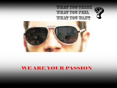
Firstly, when I created the advertising with a man face. I just focus on his glasses which mean he look at the different interiors and what his thinking. The idea is a message which helps everybody creates the new idea to change their interior and if they don not know how to change or decorate, they can contact that company.   

The image makes by owner blog ( 18/5/2016)

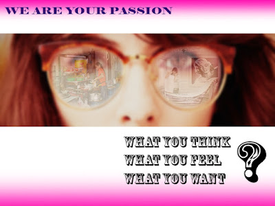
Secondly, I chose the woman to create the advertising which means the man or woman need live in the comfortable space. The special woman usually is a housekeeper who must be done the housework. Therefore, they need a luxury interior for relaxing after housework or working.


The image makes by owner blog ( 18/5/2016)


Next, this is a baby who is drawing in a room. That is different style with man or woman advertising because I want to suggest the curious in a baby sense. They usually want to make the new thing because that help them learning. Therefore, advertising shows the child's painting which will create an effect on their parents. When their parent's look at some products they will have a new idea or think about new interior.

The image makes by owner blog ( 18/5/2016)

Finally, I try to put it on the billboard. In my opinion, I think the advertising will create interesting for anybody if it stays on the big building or city centre.


The image makes by owner blog ( 18/5/2016)


The image makes by owner blog ( 18/5/2016)


The image makes by owner blog ( 18/5/2016)

After my presentation about the advertising campaign, I have some feedback about my idea. I choose the glasses idea because if a person wants to learn or create a new thing, they must look at the information or see some things. Therefore, I design two different spaces inside the glasses which mean anybody look at their house and compare another house. They will want to change or decorate again their interior after. This project does not depend on poor or rich people which just focus on how to decorate the interior.

Wednesday, 18 May 2016

Continue - Advertising campaign

I designed an advertising campaign architecture with the man glasses in last week. This advertising shows the solution of space in his glasses which compare between two interiors such as normal and and luxury house. 


The image makes by owner blog ( 12/5/2016)

Next, I create a new advertising campaign with woman image. That is similar idea man image such as compare two interiors in her glasses such as normal and luxury. In addition, the text has same which mean when customer look at this advertising campaign, they focus on her glasses and what they think in first look. Moreover, the text wants to ask customer who has comfortable with their house immediately and what you want to change.


The images make by owner blog ( 16/5/2016)

My aim of this advertising campaign is storage solution for family so that I create an campaign with baby image. Baby is a seed in each family. If they have a good environment to grow up they will have a good future. The space for baby learning and living is improtant so that is a reason to make an advertising campaign with theme family.


The images make by owner blog ( 17/5/2016)


However, I lost the logo architecture  which is important thing when give a message to business consume and contact them. Moreover, the background in all of advertisings is more colourful which need to less colour and make strong point interior.

Thursday, 12 May 2016

Lesson 3 - Advertising Campaign - Architecture

In this lesson, I design an advertising campaign about architecture space. Before that, I research some advertising architecture on the internet and magazine.


The image take from internet source ( 12/5/2016)


The image take from internet source ( 12/5/2016)


The image take from internet source ( 12/5/2016)


The image take from internet source ( 12/5/2016)


The image take from internet source ( 12/5/2016)


The image take from internet source ( 12/5/2016)


After my research, I have an idea which is advertising how you get a better space in your life. I will compare two spaces such as slum and luxury. I use photoshop to design my project and use the google image to find some pictures suitable.


The image take from internet source ( 12/5/2016)


The image take from internet source ( 12/5/2016)


The image take from internet source ( 12/5/2016)


I sketch my idea by photoshop. I put it together, the main idea is the view of the man who look different space. On the left is small space such as slum and a person is lying in the bed. On the right is luxury space such as a villa and a man is relaxing in the bath. The aim of my project is the service architecture bring to person such as storage solution. 


The image make by owner blog (12/5/2016)